4.1.6.1 Frequency Perception
In Chapter 3, we discussed the non-linear nature of pitch perception when we looked at octaves as defined in traditional Western music. The A above middle C (call it A4) on a piano keyboard sounds very much like the note that is 12 semitones above it, A5, except that A5 has a higher pitch. A5 is one octave higher than A4. A6 sounds like A5 and A4, but it’s an octave higher than A5. The progression between octaves is not linear with respect to frequency. A2’s frequency is twice the frequency of A1. A3’s frequency is twice the frequency of A2, and so forth. A simple way to think of this is that as the frequencies increase by multiplication, the perception of the pitch change increases by addition. In any case, the relationship is non-linear, as you can clearly see if you plot frequencies against octaves, as shown in Figure 4.7.
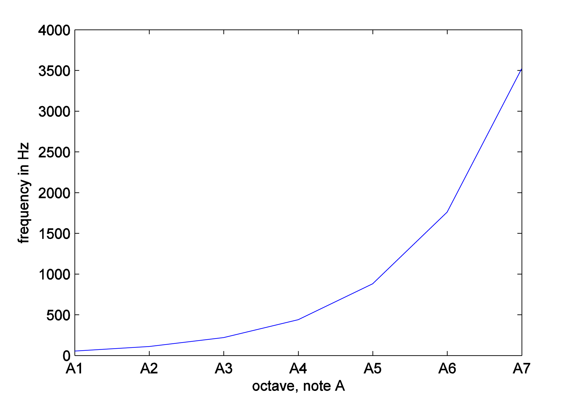
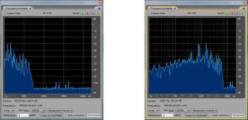
The fact that this is a non-linear relationship implies that the higher up you go in frequencies, the bigger the difference in frequency between neighboring octaves. The difference between A2 and A1 is 110 – 55 = 55 Hz while the difference between A7 and A6 is 3520 – 1760 = 1760 Hz. Because of the non-linearity of our perception, frequency response graphs often show the frequency axis on a logarithmic scale, or you’re given a choice between a linear and a logarithmic scale, as shown in Figure 4.8. Notice that you can select or deselect “linear” in the upper left hand corner. In the figure on the right, the distance between 10 and 100 Hz on the horizontal axis is the same as the distance between 100 and 1000, which is the same as 1000 and 10000. This is more in keeping with how our perception of the pitch changes as the frequencies get higher. You should always pay attention to the scale of the frequency axis in graphs such as this.
The range of frequencies within human hearing is, at best, 20 Hz to 20,000 Hz. The range varies with individuals and diminishes with age, especially for high frequencies. Our hearing is less sensitive to low frequencies than to high; that is, low frequencies have to be more intense for us to hear them than high frequencies.
Frequency resolution (also called frequency discrimination) is our ability to distinguish between two close frequencies. Frequency resolution varies by frequency, loudness, the duration of the sound, the suddenness of the frequency change, and the acuity and training of the listener’s ears. The smallest frequency change that can be noticed as a pitch change is referred to as a just-noticeable-difference (jnd). At low frequencies, it’s possible to notice a difference between frequencies that are separated by just a few Hertz. Within the 1000 Hz to 4000 Hz range, it’s possible for a person to hear a jnd of as little as 1/12 of a semitone. (But 1/12 a semitone step from 1000 Hz is about 88 Hz, while 1/12 a semitone step from 4000 Hz is about 353 Hz.) At low frequencies, tones that are separated by just a few Hertz can be distinguished as separate pitches, while at high frequencies, two tones must be separated by hundreds of Hertz before a difference is noticed.
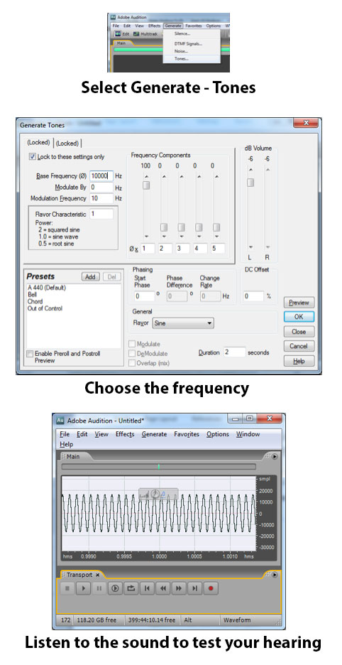
You can test your own frequency range and discrimination with a sound processing program like Audacity or Audition, generating and listening to pure tones, as shown in Figure 4.9 Be aware, however, that the monitors or headphones you use have an impact on your ability to hear the frequencies.
4.1.6.2 Critical Bands
One part of the ear’s anatomy that is helpful to consider more closely is the area in the inner ear called the basilar membrane. It is here that sound vibrations are detected, separated by frequencies, and transformed from mechanical energy to electrical impulses sent to the brain. The basilar membrane is lined with rows of hair cells and thousands of tiny hairs emanating from them. The hairs move when stimulated by vibrations, sending signals to their base cells and the attached nerve fibers, which pass electrical impulses to the brain. In his pioneering work on frequency perception, Harvey Fletcher discovered that different parts of the basilar membrane resonate more strongly to different frequencies. Thus, the membrane can be divided into frequency bands, commonly called critical bands. Each critical band of hair cells is sensitive to vibrations within a certain band of frequencies. Continued research on critical bands has shown that they play an important role in many aspects of human hearing, affecting our perception of loudness, frequency, timbre, and dissonance vs. consonance. Experiments with critical bands have also led to an understanding of frequency masking, a phenomenon that can be put to good use in audio compression.
Critical bands can be measured by the band of frequencies that they cover. Fletcher discovered the existence of critical bands in his pioneering work on the cochlear response. Critical bands are the source of our ability to distinguish one frequency from another. When a complex sound arrives at the basilar membrane, each critical band acts as a kind of bandpass filter, responding only to vibrations within its frequency spectrum. In this way, the sound is divided into frequency components. If two frequencies are received within the same band, the louder frequency can overpower the quieter one. This is the phenomenon of masking, first observed in Fletcher’s original experiments.
[aside]A bandpass filter allows only the frequencies in a defined band to pass through, filtering out all other frequencies. Bandpass filters are studied in Chapter 7.[/aside]
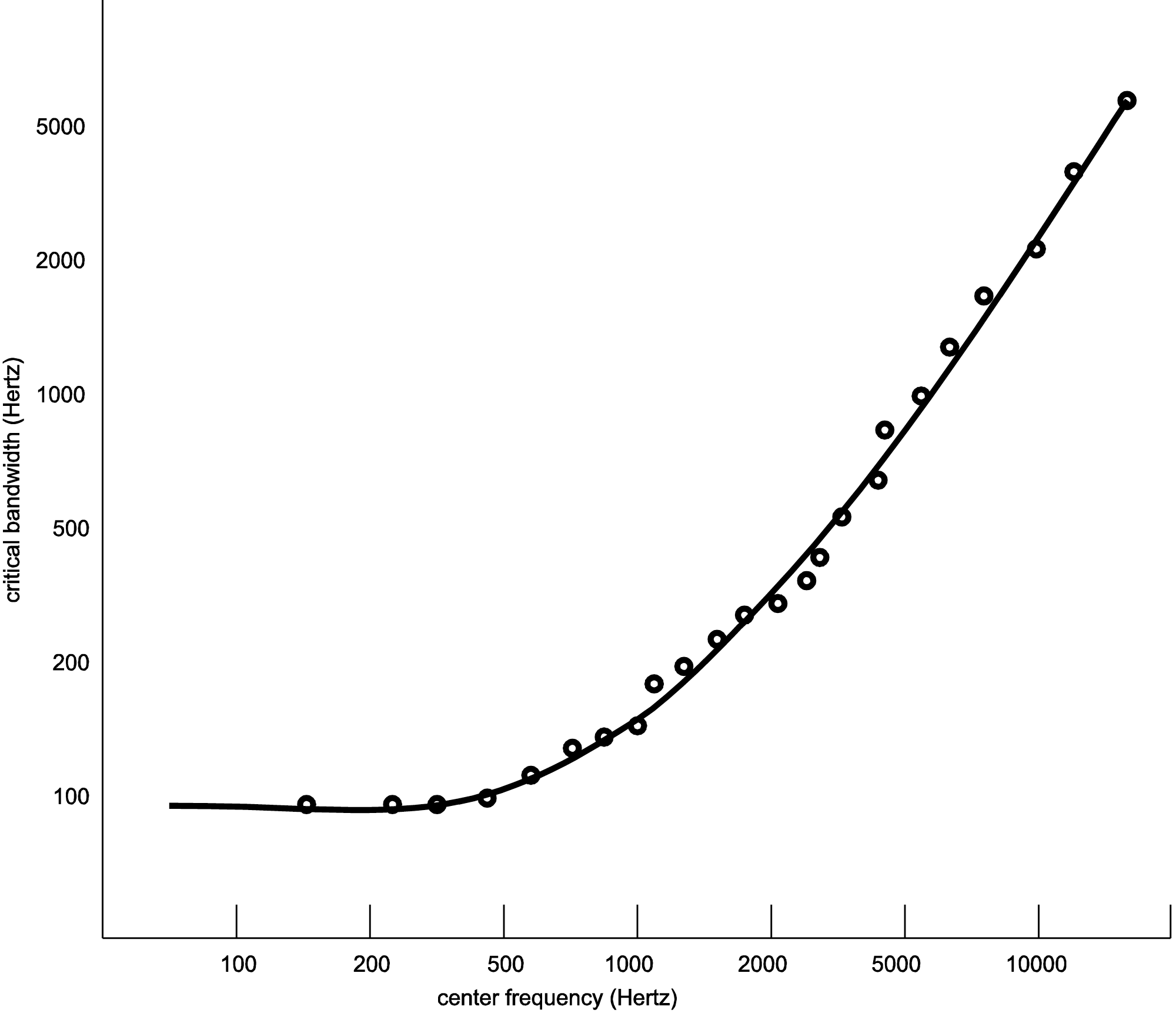
Critical bands within the ear are not fixed areas but instead are created during the experience of sound. Any audible sound can create a critical band centered on it. However, experimental analyses of critical bands have arrived at approximations that are useful guidelines in designing audio processing tools. Table 4.4 is one model taken after Fletcher, Zwicker, and Barkhausen’s independent experiments, as cited in (Tobias, 1970). Here, the basilar membrane is divided into 25 overlapping bands, each with a center frequency and with variable bandwidths across the audible spectrum. The width of each band is given in Hertz, semitones, and octaves. (The widths in semitones and octaves were derived from the widths in Hertz, as explained in Section 4.3.1.) The center frequencies are graphed against the critical bands in Hertz in Figure 4.10.
You can see from the table and figure that, measured in Hertz, the critical bands are wider for higher frequencies than for lower. This implies that there is better frequency resolution at lower frequencies because a narrower band results in less masking of frequencies in a local area.
The table shows that critical bands are generally in the range of two to four semitones wide, mostly less than four. This observation is significant as it relates to our experience of consonance vs. dissonance. Recall from Chapter 3 that a major third consists of four semitones. For example, the third from C to E is separated by four semitones (stepping from C to C#, C# to D, D to D #, and D# to E.) Thus, the notes that are played simultaneously in a third generally occupy separate critical bands. This helps to explain why thirds are generally considered consonant – each of the notes having its own critical band. Seconds, which exist in the same critical band, are considered dissonant. At very low and very high frequencies, thirds begin to lose their consonance to most listeners. This is consistent with the fact that the critical bands at the low frequencies (100-200 and 200-300 Hz) and high frequencies (over 12000 Hz) span more than a third, so that at these frequencies, a third lies within a single critical band.
[table caption=”Table 4.4 An estimate of critical bands using the Bark scale” width=”80%”]
Critical Band,Center Frequency in Hertz,Range of Frequencies in Hertz,Bandwidth in Hertz,Bandwidth in Semitones Relative to Start*,Bandwidth in Octaves Relative to Start*
1,50,1-100,100,,-
2,150,100-200,100,12,1
3,250,200-300,100,7,0.59
4,350,300–400,100,5,0.42
5,450,400–510,110,4,0.31
6,570,510–630,120,4,0.3
7,700,630–770,140,3,0.29
8,840,770–920,150,3,0.26
9,1000,920–1080,160,3,0.23
10,1170,1080–1270,190,3,0.23
11,1370,1270–1480,210,3,0.22
12,1600,1480–1720,240,3,0.22
13,1850,1720–2000,280,3,0.22
14,2150,2000–2320,320,3,0.21
15,2500,2320–2700,380,3,0.22
16,2900,2700–3150,450,3,0.22
17,3400,3150–3700,550,3,0.23
18,4000,3700–4400,700,3,0.25
19,4800,4400–5300,900,3,0.27
20,5800,5300–6400,1100,3,0.27
21,7000,6400–7700,1300,3,0.27
22,8500,7700–9500,1800,4,0.3
23,10500,9500–12000,2500,4,0.34
24,13500,12000–15500,3500,4,0.37
25,18775,15500–22050,6550,6,0.5
*See Section 4.3.2 for an explanation of how the last two columns of this table were derived.[attr colspan=”6″]
[/table]
4.1.6.3 Amplitude Perception
In the early 1930s at Bell Laboratories, groundbreaking experiments by Fletcher and Munson clarified the extent to which our perception of loudness varies with frequency (Fletcher and Munson 1933). Their results, refined by later researchers (Robinson and Dadson, 1956) and adopted as International Standard ISO 226, are illustrated in a graph of equal-loudness contours shown in Figure 4.11. In general, the graph shows how much you have to “turn up” or “turn down” a single frequency tone to make it sound equally loud to a 1000 Hz tone. Each curve on the graph represents an n-phon contour. One phon is defined as a 1000 Hz sound wave at a loudness of 1 dBSPL. An n-phon contour is created as follows:
- Frequency is on the horizontal axis and loudness in decibels is on the vertical axis
- n curves are drawn.
- Each curve, from 1 to n, represents the intensity levels necessary in order to make each frequency, across the audible spectrum, sound equal in loudness to a 1000 Hz wave at n dBSPL.
Let’s consider, for example, the 10-phon contour. This contour was creating by playing a 1000 Hz pure tone at a loudness level of 10 dBSPL, and then asking groups of listeners to say when they thought pure tones at other frequencies matched the loudness of the 1000 Hz tone. Notice that low-frequency tones had to be increased by 60 or 75 dB to sound equally loud. Some of the higher-frequency tones – in the vicinity of 3000 Hz – actually had to be turned down in volume to sound equally loud to the 10 dBSPL 1000 Hz tone. Also notice that the louder the 1000 Hz tone is, the less lower-frequency tones have to be turned up to sound equal in loudness. For example, the 90-phon contour goes up only about 30 dB to make the lowest frequencies sound equal in loudness to 1000 Hz at 90 dBSPL, whereas the 10-phon contour has to be turned up about 75 dB.
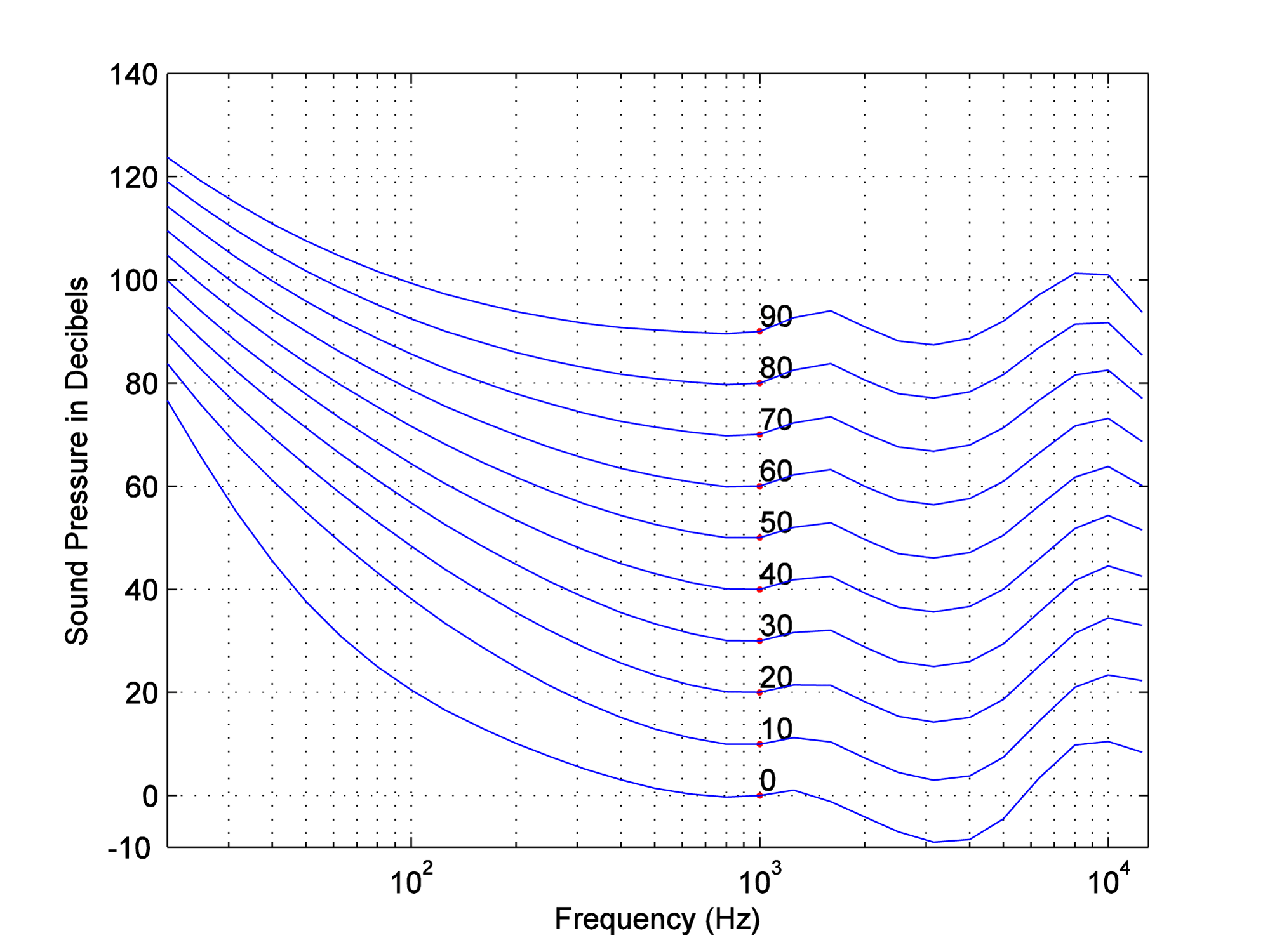
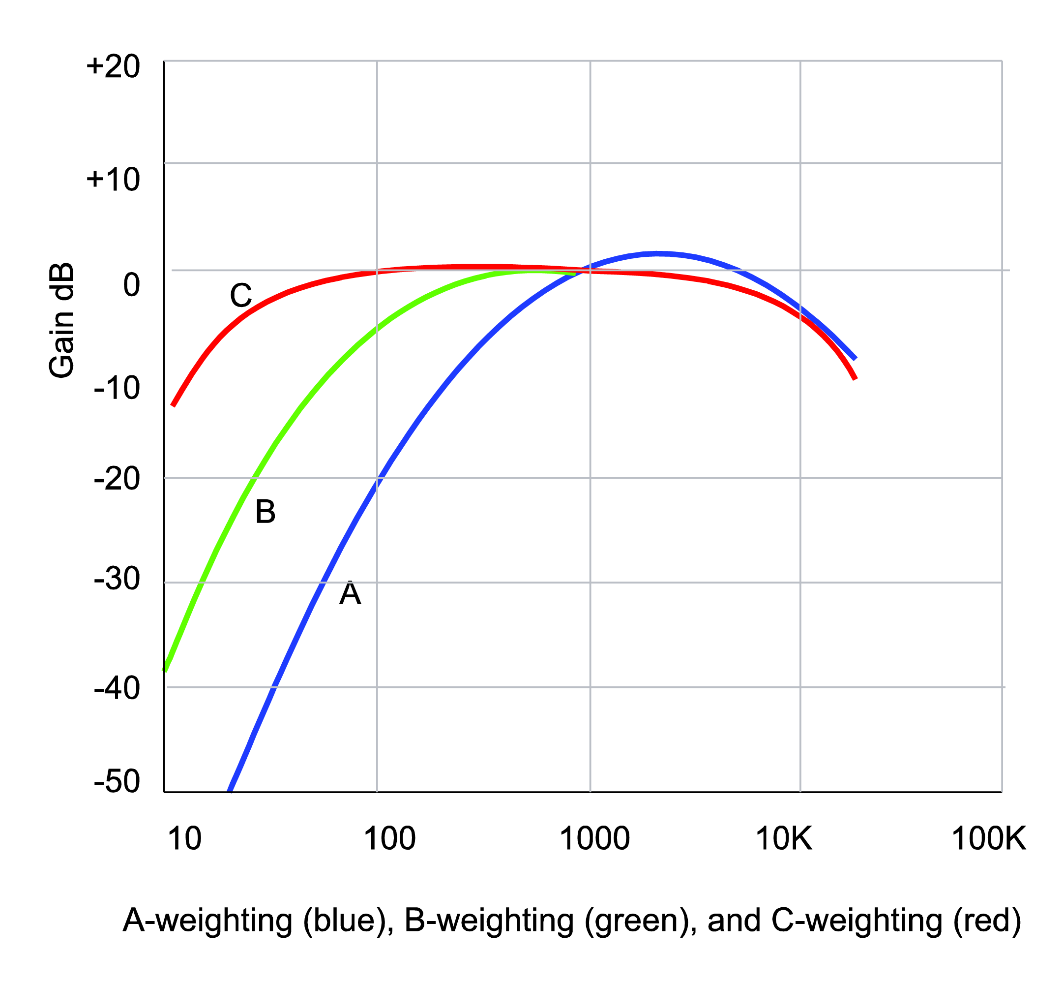
With the information captured in the equal loudness contours, devices that measure the loudness of sounds – for example, SPL meters (sound pressure level meters) – can be designed so that they compensate for the fact that low frequency sounds seem less loud than high frequency sounds at the same amplitude. This compensation is called “weighting.” Figure 4.12 graphs three weighting functions – A, B, and C. The A, B, and C-weighting functions are approximately inversions of the 40-phon, 70-phon, and 100-phon loudness contours, respectively. This implies that applying A-weighting in an SPL meter causes the meter to measure loudness in a way that matches our differences in loudness perception at 40-phons.
To understand how this works, think of the graphs of the weighting as frequency filters – also called frequency response graphs. When a weighting function is applied by an SPL meter, the meter uses a filter to reduce the influence of frequencies to which our ears are less sensitive, and conversely to increase the weight of frequencies that our ears are sensitive to. The fact that the A-weighting graph is lower on the left side than on the right means that an A-weighted SPL meter reduces the influence of low-frequency sounds as it takes its overall loudness measurement. On the other hand, it boosts the amplitude of frequencies around 3000 Hz, as seen by the bump above 0 dB around 3000 Hz. It doesn’t matter that the SPL meter meddles with frequency components as it measures loudness. After all, it isn’t measuring frequencies. It’s measuring how loud the sounds seem to our ears. The use of weighted SPL meters is discussed further in Section 4.2.2.2.
(Figure derived from a program by Jeff Tacket, posted at the MATLAB Central File Exchange)